Visualizing Criticality
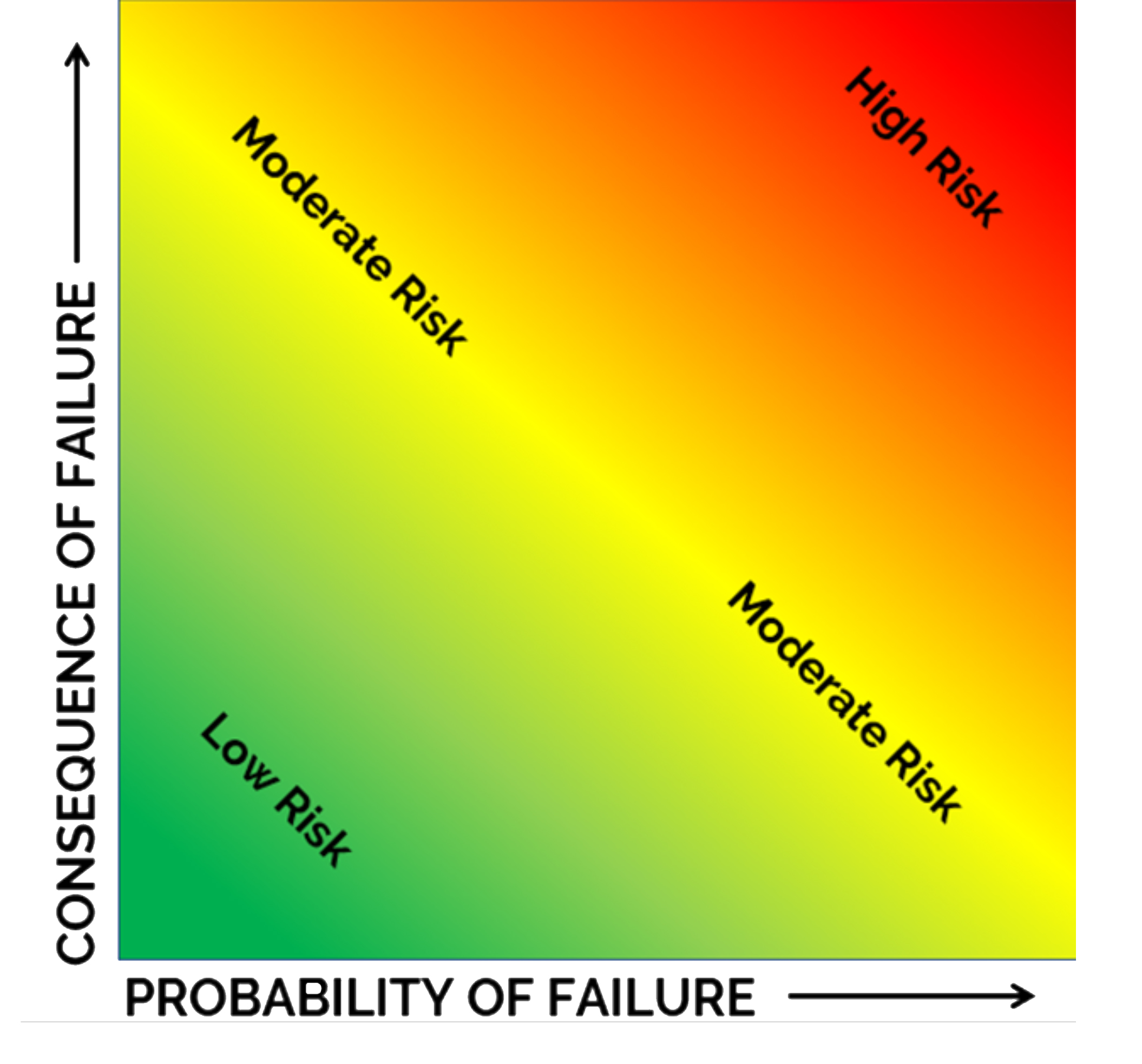
Once a criticality score has been assigned to each asset, the severity of the risk can be visualized in a matrix. Plotting the criticality score on a graph with probability of failure on the X or horizontal axis and consequence of failure on the Y or vertical axis is the easiest approach. Additionally, your rating structure for both probability and consequence of failure can be labeled on each axis. Areas of the matrix are often color-coded to increase the visual impact of the criticality of assets. Assets with criticality scores that fall into the red area have the high consequence of failure and probability of failure. In contrast, assets with criticality scores that fall into the green area have low consequences of failure and low probability of failure.
Reading the chart
Red Zone: This area is where assets with high criticality scores are. The are the highest priority and should be targeted for early replacement or rehabilitation, prior to the asset failing. These assets represent events the system does not want to occur, and it is worth sacrificing some asset life to prevent failure.
Orange Zone: This area is where assets with either high probability or high consequence of failure are. These assets are often critical but may be able to last through additional planning for repair or replacement. It is imperative to monitor and plan for assets in the orange zone as they can quickly move into the red zone.
Yellow Zone: Assets in this area should be monitored to determine when the probability of failure increases or when a potential failure may occur. Assets along the yellow zone may have a range of criticality scores that feature high PoF or CoF rankings, but their overall criticality score is moderate. Some of these assets may be eligible for a run to failure strategy.
Green Zone: This area is where assets with low probability and low consequence of failure are. These assets may be ideal to run to failure to get maximum life out of the asset. Run to failure is a management strategy that can be used when appropriate because the consequences of failure are low. This management style requires that the utility be prepared to act when the asset does fail (perhaps by having spare parts on hand or ensuring proper operator training) but does not require acting prior to the failure.
The matrix makes it easy to compare assets and determine which of the assets are most critical. This is a useful tool for communicating asset risk to board members or community members who may not understand what a particular criticality score means.
Below are three other examples of ways to represent criticality scores visually. These can be adjusted to fit your utility’s needs and may help effectively communicate risk internally and with external stakeholders. These examples are from a wastewater system assessing one of their pump stations. Asset ID’s have been removed for anonymity.
Table 1: Pump Station Asset Risks in Order of Risk Score
This example has each asset listed in the order of its risk score. High risk scores are highlighted in red, medium-high risk scores are highlighted in orange, medium risk assets are highlighted in yellow, and low risk assets are highlighted in green.

Table 2: Pump Station Asset Risks by Risk Score
This table shows the number of assets within each risk score. Each box below signifies a specific risk and indicates the number of assets with that score as well as the percentage of assets with that score.

Table 3: Pump Station Asset Risks by Risk Score
This chart visualizes the risk of each asset. The highest risk assets are shown in the upper right and the lowest risk assets are shown in the lower left corner. Each asset is labeled and marked on the chart in accordance with its criticality score.
